Monday, 18 May 2015

Photoshop and how it is used in the industry

The following images are taken from a video of 6 hours of editing that is done on a photograph that will be used for advertisement in the fashion industry, I first attempted to upload the video but was unsuccessful, so I have chosen what I think are the four most drastic changes that happened during this unrealistic transformation.


Beauty may be in the eye of the beholder, but it can be digitally enhanced in myriad ways with the mere click of a mouse.
A new series of revealing time-lapse videos shows just how much happens to fashion photos, from their untouched beginning to their high-gloss, magazine-quality end.


After watching this 90 second time lapse video of a 6 hour photoshop touch up for advertisements I am in shock as to the extent of editing that actually goes into this type of work, as you can see the before and after picture are pretty much a different person after having their skin, hair, skin, lips, contrasts, shimmer, basically every aspect of the picture has been modified in some sort of way, it takes a lot of skill to be able to edit something at this level.

Monday, 13 April 2015

Final CD covers.


I have chosen this design idea for my final CD cover instead of the silk weave image because I am in love with everything about it, the sinister side to the photo and the colour contrasts that compliment the sadistic side to the image, I also think that the minimal splashes of bright colour are really effective and create a more eye catching look to this image. This is not a picture that I have taken as I found it on the internet and edited it myself, I would love the chance to do a photoshoot using a similar subject matter to see what my own work would look like as a comparison.


Monday, 23 March 2015

Weave Silk CD Cover


This is the first idea I have got for my CD Cover, I have used a website/app called weave silk to create this image, the software creates an array of colours (colours of your choice) mirroring and printing the moving colours around the selected area.
I am going to pick my favourite silk weave image to then change into a very gothic CD cover.
I have chosen to use a silk weave for my final CD cover because I love all of the unique patterns it creates none the same.


Posters


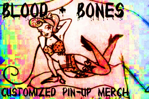
For this poster I have made the image look very bitmapped and old so to match the pin up vibe to the subject of the image. I am very happy with the outcome as I think it looks very unique and the final outcome has turned out as well as I had hoped.

Monday, 2 March 2015

White Screen Projection

 White screen projection:

White screen projection is very similar to black screen projection photography, obviously the sheet is white instead of black.
This effects the outcome of the photo by making the colours more vibrant and it also means that the image you are projecting onto your subject will not only show on your subject but also across the white screen as well.


Monday, 23 February 2015

Black Screen Projection


 Black screen projection:

When using black screens in projection photography your images that you take will only show the projection being on the subject of your image which will be placed in front of your screen.

I really like the use of black screens in projection photography because it makes the colours appear much more vivid and this then enhances the images and the colours used.

                              Because the screen is black it absorbs the colour that is being projected from the projector because of the darkness of the screen.


Monday, 9 February 2015

CD cover experiments

 I found this image on google search and thought that it would be perfect to experiment with the style of image/design style that I would like to use for my CD cover, I adore the use of minimalistic colours and I believe that this style of image would suit my work amazingly, I am in awe at how well this image is put together with not only the subject of the image looking distressed but also her outfit and the background, thus piecing the image together to make it look more complete and in place.


To improve this image for my CD cover experiment I have played with the use of dark tones and bright tones used in the image to make the colours in the image contrast more and stand out more brightly, I love how bright the red is now as it catches the viewers attention more than the first image, I have then used a red (as similar to that in the image) and made up a name for the album to make it look more like an album cover, I think that the image works really well and would love to continue making improvements to this for my finished CD cover.